

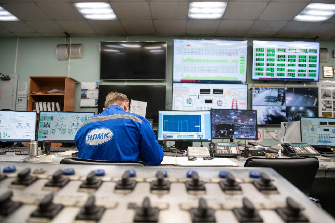
Imagine opening the production dashboard during an incident and seeing this:
CPU:                  42%
Memory:               61%
Database connections: 55%
HTTP success rate:    99.7%
Average latency:      118 ms
Kafka brokers:        healthy
Every graph is green.
Meanwhile, customers are telling you:
“Orders are disappearing.”
That sounds contradictory only if we assume that healthy components imply a healthy system.
They do not.
A server can be healthy while returning the wrong result. A Kafka cluster can be healthy while an event disappears farther downstream. A queue can be operating correctly while work accumulates faster than consumers can drain it. A database can have plenty of global capacity while one tenant's queries consistently time out. An average latency chart can look excellent while a small but important group of users waits several seconds.
Google's SRE guidance makes a useful distinction here: monitoring should help answer both what is broken and why it is broken. Those are different questions. CPU, heap, connection counts, and queue depth often help explain why. User-visible latency, errors, and correctness tell us what.
That leads to the observability question I find much more useful than asking whether every process is alive:
What signal would prove that the user-visible operation actually succeeded?
Answering that requires looking beyond component dashboards and measuring the behavior of the complete system.
Component Health Is Not System Health
Consider an order-processing pipeline:
Now suppose the following are all true:
API returns 200

database write succeeds

Kafka accepts the event

consumer process is running

payment API is healthy
Every individual component can report:
healthy
while the order event still fails to reach the consumer because of a bug somewhere in the intermediate delivery path.
The infrastructure is alive.
The business operation is incomplete.
That distinction matters because many dashboards are dominated by signals such as:
CPU
memory
disk
process up/down
connection count
Those metrics are valuable. They tell us whether infrastructure is saturated, leaking memory, disconnected, or unavailable.
They do not necessarily tell us whether the system is doing the right thing.
For a distributed workflow, the most important failure may exist between individually healthy components. The API believes it handed work to Kafka. Kafka believes it accepted the record. The consumer process is alive. The payment service is available. Yet the order never progresses.
That gap is where component-oriented monitoring often stops and end-to-end observability needs to begin.
Start With User-Visible Signals
Google SRE's four golden signals are:
latency
traffic
errors
saturation
The interesting part is not memorizing the list. It is that the first questions describe service behavior rather than machine behavior.
For an API, I would rather begin with:
How many requests are arriving?

How long are successful requests taking?

How long are failed requests taking?

How many logical operations are failing?

How close is the system to its limiting resource?
and then investigate:
CPU
memory
threads
connection pools
queues
database latency
cache behavior
dependency health
to explain what we see.
That ordering matters.
CPU at 90% may be perfectly acceptable if customer latency and error rates remain healthy. CPU at 40% tells me almost nothing if checkout success has fallen to 70%.
Infrastructure telemetry is usually strongest when it explains a service-level symptom rather than being treated as the definition of service health.
The four signals need domain context
Even high-level signals can be too generic if they are measured at the wrong boundary.
For example:
HTTP error rate = 0.3%
may sound healthy.
But if nearly all of those errors come from:
POST /checkout
while high-volume health checks and read-only endpoints succeed, the aggregate error rate is hiding the operation that matters most.
The same idea applies to saturation. A machine may have spare CPU while its database connection pool is exhausted. Kafka brokers may have abundant capacity while one consumer partition is hours behind.
The correct saturation metric depends on the resource that actually limits the user-visible operation.
Averages Can Hide the Failure
Suppose a service handles 1,000 requests.
Nine hundred ninety complete in:
80 ms
while ten take:
5 seconds
The average is only about:
129 ms
That sounds fairly healthy.
But:
1% of users waited 5 seconds
and that one percent becomes more important when one user request fans out across several services. Each dependency gives the overall operation another opportunity to fall into someone's latency tail.
That is why latency distributions matter more than a single mean.
A useful summary might look like:
| Metric | Latency |
|---|---|
| Average | 129 ms |
| p50 | 80 ms |
| p95 | 92 ms |
| p99 | 4.8 s |
The average says:
service looks fine
The p99 says:
one request in a hundred is experiencing
a completely different service
Those are both statistically correct descriptions of the same system.
Only one of them tells you why customers might be complaining.
Failed requests can make latency look better
There is an even more misleading version.
Suppose successful database-backed requests normally take:
300 ms
Then the database becomes unreachable and requests begin returning:
HTTP 500
in:
5 ms
If successful and failed requests are combined into one latency metric, the aggregate can improve during the outage.
For example:
Before incident:
average latency = 300 ms

During incident:
90% success at 300 ms
10% failure at 5 ms
The service became less reliable.
The dashboard became faster.
That is why successful and failed latency should often be separated:
request_latency{
    outcome="success"
}

request_latency{
    outcome="failure"
}
Averages are not wrong.
They simply answer a narrower question than operators sometimes think they do.
HTTP Success Is Not Business Success
Another dangerous simplification is:
200 = success
500 = failure
Imagine an API returns:
{
  "status": "complete",
  "items": []
}
with HTTP 200.
The correct response should have contained 25 items.
From HTTP's perspective:
success
From the customer's perspective:
data missing
Google SRE describes this kind of situation as an implicit failure: the protocol reports success while the content or business result is wrong. Those failures can be invisible if monitoring stops at status codes.
Application telemetry therefore needs signals that represent domain outcomes.
For an order system:
orders_created

orders_paid

orders_fulfilled

orders_cancelled
For a data pipeline:
events_produced

events_received

events_processed

events_persisted
For authentication:
login_attempted

login_completed

token_issued
Those counters let us ask whether transitions that should correspond actually do.
An HTTP request may succeed while the asynchronous work triggered by that request never completes. If the business operation spans several systems, protocol-level success at the first boundary is only one part of the story.
End-to-End Counts Reveal Missing Work
Uber built Chaperone to solve exactly this kind of visibility problem in its Kafka infrastructure.
The pipeline contained several stages:
application
→ proxy client
→ proxy server
→ regional Kafka
→ replication
→ aggregate Kafka
Monitoring the individual brokers and replication components could not reliably answer the more important question:
Did every message actually make it through?
Chaperone therefore audited message counts at multiple stages of the pipeline to detect:
loss
lag
duplication
end to end.
Uber described an incident in which a replication component entered a dead loop after unexpected broker errors. Normal broker and replication alerts did not expose the problem, but the count discrepancy did.
That is almost the perfect example of why a healthy component dashboard can be misleading.
The components were observable.
The business path was not.
Monitor conservation laws
Many distributed workflows have approximate invariants that act like conservation laws.
For example:
events_in
≈
events_out
or:
orders_created
≈
orders_processed
+
orders_pending
+
orders_failed
or:
money_authorized
≈
money_captured
+
money_released
+
money_pending
The values may not match instantaneously. Asynchronous processing, retries, and queueing introduce delay.
But persistent divergence is meaningful.
If:
events produced: 10,000,000
events consumed:  9,997,400
the Kafka broker CPU graph may not care.
The business probably should.
This style of monitoring asks whether work is conserved across the workflow rather than merely whether every participating process is alive.
Slice the System Where Failures Can Hide
Aggregation is necessary.
Without it, observability systems would become unreadable.
But every aggregate removes information.
Suppose a Kafka topic has 100 partitions.
Ninety-nine have:
lag = 0
and one has:
lag = 100,000
The average lag is:
1,000
If your alarm threshold is:
10,000
nothing fires.
Every event routed to that one partition is still severely delayed.
The same problem appears across:
regions
availability zones
tenants
customers
shards
database replicas
API routes
application versions
This is why every aggregate makes me want to ask:
Across what?
If a dashboard says:
p99 latency = 300 ms
I want to know:
Which endpoint?

Which tenant?

Which region?

Which status class?

Which dependency?

Which request type?

Which deployment version?
A global number is often useful for detecting broad incidents.
It may be useless for detecting a narrow one.
Stripe's slice monitoring
Stripe has described monitoring payment performance across narrow slices of traffic because aggregate success metrics can hide severe problems affecting specific combinations such as:
country
+
issuer
+
card type
+
payment method
A degradation affecting one payment path may barely move a global platform-wide metric while being catastrophic for the customers using that path.
The same principle applies to multi-tenant software.
Suppose:
Tenant A: 99.99%
Tenant B: 99.98%
Tenant C: 71.2%
The global availability number may still look excellent.
Tenant C experiences an outage.
Both dashboards are telling the truth.
They are measuring different populations.
High cardinality is not free
The answer is not to attach every possible identifier to every metric.
Prometheus-style metrics work well for dimensions whose value sets remain reasonably bounded:
region
status_code
route
service
deployment_version
They are a poor place for effectively unlimited values such as:
user_id
request_id
order_id
email
because each distinct combination can create another time series.
Cardinality explodes.
Storage and query cost follow.
High-cardinality investigation is usually better suited to structured logs and distributed traces.
The design problem is deciding which questions need to be cheap enough to answer continuously and which questions can be investigated on demand.
Use Metrics, Logs, and Traces Together
Metrics, logs, and traces are most useful when they answer different parts of the same incident.
Metrics tell you that something changed
Metrics are excellent at questions such as:
Did p99 latency increase?

Is error rate rising?

Is queue depth growing?

Is cache hit rate falling?

Which region is affected?
A metric might look like:
http_requests_total{
  service="checkout",
  route="/checkout",
  status="500",
  region="us-east-1"
}
and latency might be represented through a histogram such as:
http_request_duration_seconds_bucket{
  service="checkout",
  route="/checkout"
}
Metrics are compact, easy to aggregate, and excellent for alerting.
They usually cannot tell you what happened to one specific request.
Structured logs tell you what happened
This log:
Checkout failed
is weak.
A structured record gives the failure context:
{
  "timestamp": "2026-10-01T05:21:13Z",
  "level": "error",
  "service": "checkout-api",
  "requestId": "req_a719",
  "tenantId": "tenant_42",
  "orderId": "ord_9832",
  "dependency": "payments",
  "operation": "authorize",
  "attempt": 2,
  "durationMs": 812,
  "errorCode": "UPSTREAM_TIMEOUT"
}
Now we can ask:
Show every failure for req_a719.

Show payment failures for tenant_42.

Show timeouts after deployment v91.

Show operations that required more than two attempts.
Structured context converts a log from a sentence into something operators can query.
Traces tell you where time went
Suppose:
POST /checkout
takes:
2.4 seconds
The API latency metric tells us a symptom exists.
A trace can show the path:
API Gateway          10 ms
Checkout Service     80 ms
Inventory            40 ms
Payments          2,180 ms
Database              60 ms
The investigation has changed from:
Why is checkout slow?
to:
Why did payments take 2.18 seconds?
That is a much smaller search space.
Shared context makes the tools one system
A strong incident workflow might look like:
metric:
checkout p99 increased

dashboard slice:
only us-east-1 affected

trace:
payment dependency dominates latency

request ID:
req_a719

logs:
first payment call timed out,
retry succeeded
That is one connected story.
The weaker version is:
CloudWatch uses hostname A

Sentry uses another identifier

application logs use unrelated UUIDs

Kafka uses event IDs

nothing connects them
You can have enormous amounts of telemetry and still struggle to follow one operation.
Retries and Queues Can Mask Degradation
Resilience mechanisms are valuable precisely because they hide temporary failures from users.
That also means they can hide a worsening system from operators.
Retries can preserve top-level success while dependencies degrade
Suppose a dependency normally succeeds:
99.9%
Then it degrades to:
90%
The application retries once.
Many second attempts succeed, so user-visible availability may remain around:
99%
That sounds encouraging.
But internally:
dependency errors increased

attempt count increased

request latency increased

retry amplification increased
The system is much closer to the edge even though the top-level success graph remains green.
I therefore want separate metrics such as:
logical_requests_total

attempts_total

retries_total

dependency_errors_total

user_visible_failures_total
Otherwise a recovery mechanism can hide degradation until its own capacity is exhausted.
Queues hide imbalance by design
Suppose producers emit:
1,000 events/sec
and consumers normally process:
1,000 events/sec
Then processing capacity falls to:
900 events/sec
Nothing necessarily fails immediately.
Producer:
healthy
Kafka:
healthy
Consumer:
healthy
Yet backlog grows by:
100 events/sec
After one hour:
360,000 events behind
The important metrics are not merely:
consumer process = up
but:
arrival rate
processing rate
lag
age of oldest event
estimated drain time
Age often matters more than queue depth
Suppose two queues each contain:
100,000 messages
Queue A receives:
100,000/sec
and drains:
110,000/sec
It is recovering.
Queue B receives:
1,000/sec
and drains:
900/sec
It is getting worse.
Same backlog.
Completely different health.
Signals such as:
d(lag)/dt
and:
age of oldest pending work
describe the operational state much better than an isolated queue-depth number.
Black-Box Monitoring Tests the User Path
White-box monitoring asks:
What does the application report
about itself?
Black-box monitoring asks:
Can an outside user actually
complete the operation?
Google SRE recommends using both, especially black-box checks for critical externally visible behavior.
A synthetic checkout could perform:
create test user
→ add product
→ checkout
→ verify order exists
→ verify payment state
Now imagine:
CPU healthy

Redis healthy

database healthy

HTTP health endpoint = 200
while that synthetic transaction consistently fails.
Production is not healthy.
The end-to-end check is testing the promise made to the user rather than the survival of the components implementing it.
/health answers a narrow question
Consider:
GET /health

200 OK
That may prove:
process started

HTTP listener works
It does not necessarily prove:
database writes work

Kafka publishes work

payment flow works

cache invalidation works

webhook processing works
Health endpoints are useful.
The mistake is interpreting:
container alive
as:
business healthy
Those are different guarantees and deserve different signals.
Alert on Symptoms, Diagnose With Causes
Google draws a useful distinction between symptoms and causes.
Consider:
Database CPU > 90%
That is a possible cause of an incident.
It may also be normal during a known batch workload.
Now consider:
Checkout failure rate > 5%
That is a user-facing symptom.
Someone is actually being affected.
A useful alerting hierarchy might therefore look like:
PAGE:

SLO burn rate too high

checkout failure rate exceeds objective

p99 successful latency exceeds objective

synthetic transaction repeatedly fails
and then:
INVESTIGATE:

database CPU high

connection pool saturated

cache hit rate falling

consumer lag increasing

retry rate increasing
Cause metrics remain essential.
They are what help us fix the incident.
But paging primarily on symptoms keeps the alert tied to an actual customer-facing promise instead of every unusual resource fluctuation.
A global symptom can still hide a local outage
Even symptom-based monitoring can become too aggregated.
If a platform has:
1,000 tenants
and one enterprise tenant represents:
0.3% of traffic
that tenant could suffer:
100% failure
while platform-wide availability remains around:
99.7%
The global SLO still needs strategic slicing where important customer populations or workflows can fail independently.
This is where service-level monitoring and dimensional analysis have to work together.
Observability Has Its Own Cost and Noise
Once engineers discover these blind spots, the natural reaction is:
measure everything

alert on everything

retain everything
That creates different failures.
More alerts can reduce awareness
Monitoring thousands of dimensions creates random deviations simply because the number of things being evaluated is large.
Stripe's payment-slice monitoring faces this problem directly. It uses stateful evaluation rather than alerting immediately on every fluctuation so the monitoring system can maintain useful precision while still covering many possible degradation slices.
The broader lesson is:
An observability system has a signal-to-noise budget.
An alert that fires every day and gets ignored is functionally not an alert.
Sampling can hide rare failures
Distributed tracing can be expensive.
At:
100,000 requests/sec
retaining every trace may be unnecessary.
So perhaps we sample:
1%
That controls cost.
But a failure affecting:
0.01%
of traffic may now be poorly represented.
Random sampling can discard exactly the rare trace you wanted.
A more targeted policy might retain:
100% of errors

100% of very slow requests

more unusual tenant or route traffic

a smaller sample of healthy requests
Outcome-aware or tail-based approaches trade implementation complexity for better retention of interesting failures.
Instrumentation is production work
Every:
log line
metric
span
stack trace
costs some combination of:
CPU
memory
network
storage
money
AWS's observability guidance explicitly acknowledges these cost and complexity tradeoffs.
The goal is not maximal telemetry.
It is enough telemetry to answer important operational questions without making observability itself a significant source of production cost or failure.
Design Telemetry Around Questions and Context
Observability design often begins with tooling:
We use Prometheus.

We use Grafana.

We use Sentry.

We use CloudWatch.

We use OpenTelemetry.
That tells me very little about which failures the system can detect.
I would rather begin with questions:
Can users complete checkout?

Are events being lost between Kafka stages?

Which tenants have elevated failure rates?

Which dependency dominates p99 latency?

Are retries increasing?

Can consumers drain the current backlog?

Which deployment introduced the problem?

Are expected business-state transitions completing?
Then choose telemetry capable of answering them.
The questions define the monitoring system.
The tools implement it.
Propagate context across a request
Imagine a checkout begins with:
requestId = req_92f1
I want that context to remain useful across boundaries:
An API log might contain:
{
  "requestId": "req_92f1",
  "service": "order-api",
  "event": "order.created"
}
and later:
{
  "requestId": "req_92f1",
  "service": "payment-worker",
  "event": "payment.retry",
  "attempt": 2
}
Now an operator can reconstruct the journey.
Asynchronous systems need several identities
A request ID alone is not always enough because the HTTP request may finish long before asynchronous work completes.
It can be useful to preserve distinct identities such as:
request_id
trace_id
event_id
business_operation_id
correlation_id
causation_id
For example:
{
  "traceId": "tr_7cd",
  "eventId": "evt_871",
  "orderId": "ord_991",
  "causationId": "evt_721",
  "correlationId": "checkout_442"
}
These answer different questions:
eventId:
Which exact message is this?

correlationId:
Which business workflow does this belong to?

causationId:
Which event caused this event?

traceId:
Which distributed execution path are we observing?
That distinction becomes particularly valuable once retries, fan-out, replay, or asynchronous processing enter the system.
Monitor Business Transitions
Infrastructure tells us:
Kafka up
database up
workers up
Business telemetry can tell us:
10,000 orders created

9,999 payment attempts

9,998 payments completed

9,997 fulfillment requests
If one stage starts diverging from the previous one, that gives us a much more meaningful investigation point than:
all containers are running
This style of monitoring follows the operation customers actually care about.
It also helps distinguish normal asynchronous delay from lost work.
For example, if:
orders_created - orders_paid
normally remains around 50 because payment processing takes a few seconds, a temporary difference is expected.
If the gap grows to:
10,000
and continues increasing, the system has entered a different state even if every component is still responding to health checks.
Domain-level telemetry turns business invariants into operational signals.
Build Dashboards Around Failure Hypotheses
I like operational dashboards with layers that move from user impact toward technical explanation.
Layer 1: user symptoms
availability

business success rate

p95 / p99 latency

SLO burn

synthetic transaction success
Layer 2: workload behavior
traffic

retry rate

queue lag

oldest work age

cache hit rate

event throughput
Layer 3: dependencies
database latency

external API latency and errors

Redis latency

Kafka delivery and consumer health
Layer 4: resources
CPU

memory

threads

connections

disk

network
That naturally moves the investigation from:
what is broken?
toward:
why?
instead of beginning with 40 CPU graphs and asking the operator to infer whether customers are affected.
Organize views around incidents, not products
Instead of only:
Dashboard: PostgreSQL
I want views that answer specific failure hypotheses.
For checkout latency increased:
checkout p99
payment p99
database p99
cache hit rate
retry rate
connection-pool wait
deployment version
For Kafka processing delayed:
arrival rate
processing rate
per-partition lag
oldest event age
consumer rebalances
database latency
consumer errors
For one tenant reports failures:
tenant request volume
tenant errors
tenant latency
authorization failures
database query latency
region
deployment version
Those dashboards are diagnostic tools.
A dashboard grouped only by infrastructure ownership is often a metric gallery.
Test the Observability System With Failure Injection
How do we know monitoring actually detects the failures we care about?
Break things deliberately.
For example:
make one dependency return 500

slow one database query

pause one Kafka consumer

drop one class of events

return HTTP 200 with incomplete data

disable Redis

make one tenant fail authorization

inject 3-second latency into one region
Then ask:
Did an alert fire?

Which dashboard changed?

Could we identify affected users?

Could we identify the failed boundary?

Did shared IDs connect the evidence?

Would an on-call engineer understand
what happened?
A monitoring system that has never been tested against failure remains partly theoretical.
This is also a good way to discover blind spots created by aggregation.
Perhaps the dependency failure produces a clear error-rate spike.
Perhaps the missing-event failure changes no infrastructure metric at all.
Perhaps the one-tenant failure disappears inside the global average.
The experiment tells you whether the telemetry model matches the real failure model.
The Dashboard Is a Model, Not Reality
This may be the most important idea in the article.
A dashboard does not show your system.
It shows:
the measurements you chose to collect, retain, aggregate, and visualize
If you measure only:
average CPU

average latency

global error rate
then your dashboard describes a world in which:
latency tails

individual tenants

partitions

rare failures

semantic correctness

asynchronous workflow completion
barely exist.
The system itself has not become simpler.
Only the representation has.
That is why green dashboards are not inherently reassuring. Green means the measured signals remain inside their expected ranges.
It does not prove that every important property of the system is healthy.
The most useful question I can ask when reviewing a dashboard is:
Which important failure could happen without materially changing any signal on this page?
The answer is an observability gap.
Find enough of those gaps and a dashboard stops being a passive collection of charts. It becomes an explicit model of the promises the system is supposed to keep.
The Invariants I Want
For observability, I care about guarantees such as:
A customer-facing failure should produce
an observable signal.

One failed tenant must not disappear
inside a global average.

One slow partition must not disappear
inside a cluster average.

Failed requests must not make latency
dashboards appear healthier.

Retries must be distinguishable from
logical operations.

Queued work must expose both depth
and age.

Business workflows must expose
important state-transition counts.

Important operations should remain
traceable across service boundaries.

Logs, metrics, and traces should share
enough context to reconstruct an incident.

End-to-end correctness must be observable
independently from component health.

Critical observability assumptions should be
tested through deliberate failure injection.
Those are much stronger than:
we have dashboards
or:
we use Prometheus
Observability is not the presence of telemetry.
It is the ability to answer important questions during failure.
Final Thought
Distributed systems often fail in the gaps:
API and queue

queue and consumer

consumer and database

database commit and external side effect
Each component may honestly report:
“I am healthy.”
while the workflow they collectively implement is broken.
That is why a green dashboard can be dangerous—not because the measurements are necessarily wrong, but because aggregation changes what is visible.
Averages hide tails.
Global metrics hide broken tenants.
Broker health hides missing business events.
HTTP status hides semantic failures.
Retries hide deteriorating dependencies.
Queues hide temporary inability to keep up.
Infrastructure health hides workflows that never reach completion.
So when I review an observability design, the question I care about most is not:
“What metrics are we collecting?”
It is:
“Which important failure could happen without changing any of these metrics?”
Whatever answer you find is your next observability gap.
Once you start thinking that way, dashboards stop being status screens. They become models of the guarantees the system is supposed to provide.
The goal is to make those models honest enough that when the system fails, the dashboard fails with it.
References
-
Google SRE — Monitoring Distributed Systems. Introduces symptom-versus-cause monitoring, black-box versus white-box monitoring, the four golden signals, tail latency, and the danger of aggregate metrics that obscure real user failures.
-
Google SRE Workbook — Monitoring Systems with Advanced Analytics. Discusses dependency instrumentation and the importance of dimensions that let operators separate failures by method, peer, and response behavior instead of relying on opaque aggregate metrics.
-
Uber Engineering — Introducing Chaperone: How Uber Engineering Audits Apache Kafka End-to-End. Describes auditing message counts and latency across multiple Kafka pipeline stages to detect loss, lag, and duplication that normal component-health metrics could miss.
-
Stripe — Using ML to Detect and Respond to Performance Degradations in Slices of Stripe Payments. Shows why aggregate platform metrics can hide severe failures affecting narrow customer or payment segments and how Stripe monitors high-dimensional slices while controlling alert noise.
-
AWS Well-Architected — End-to-End Tracing and Application Telemetry. Recommends combining workload metrics, dependency telemetry, synthetic monitoring, and end-to-end request tracing so failures can be investigated across service boundaries rather than component by component.